
The Infographic Design Report: Trends to Try in 2024

Tired of the same old bar charts and pie graphs? In 2024, infographic design is taking a bold leap forward.
It’s time to leave behind tired tropes and embrace fresh, innovative approaches. Because this year, it’s all about pushing boundaries and experimenting with new technologies.
Get ready to ditch the data dumps and step into a world of captivating visuals, interactive elements and immersive storytelling.
This report is your ultimate guide to navigating infographic design in 2024. So, buckle up and prepare to be inspired—trust me, it’s anything but ordinary.
Infographic design trends of 2024:
1. Bold typography
2. Playful layouts
3. Data as illustrations
4. Custom illustrations
5. AI-generated infographics
6. Accessibility for all
7. Interactive infographics
Revisit trends from 2023: Infographic Trends to Try in 2023

1. Bold typography
Beyond mere size and weight, bold typography is a multifaceted playground waiting to be explored. It’s about pushing the boundaries of text, transforming it from information carrier to artistic expression.
Bold typography takes center stage in headlines with oversized styles, unexpected placements and dynamic spacing. Picture playful serifs dancing alongside sleek sans-serifs, all infused with vibrant colors and textures that make them leap off the screen.
Take this infographic by Visual Capitalist on global currencies in 2023 for example, the headline screams attention-grabbing sirens with supersized fonts that instantly grab eyes.
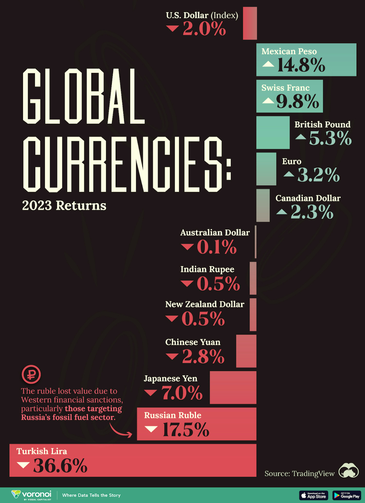
Source: Visual Capitalist
A good tip with fonts is to give up being generic and embrace individuality. Select fonts that complement the tone and concept of your infographic. Let the font define the tone of the post.
Use a fun handwritten font for a humorous topic or a sleek geometric design for a tech-focused article. To ensure that your headlines stand out from the crowd, use vivid colors against backgrounds with strong contrast.
This career infographic highlights keywords such as “moving to NYC” and “acting career” with bright colors to capture the reader’s attention at first sight. The design also uses different font sizes in the headings to create an information hierarchy to guide readers throughout.

But typography is more than just shouting. It also involves telling a story and directing readers through the information and insights in your infographic.
To establish a hierarchy of information, use a variety of font styles, weights and sizes. Important data points are bolded for emphasis, headlines stand out and subheadings provide direction.
I love how this infographic presents key metrics side by side – the clear icons and colors make it visually engaging and the varying font sizes ensure I can easily grasp the important points.
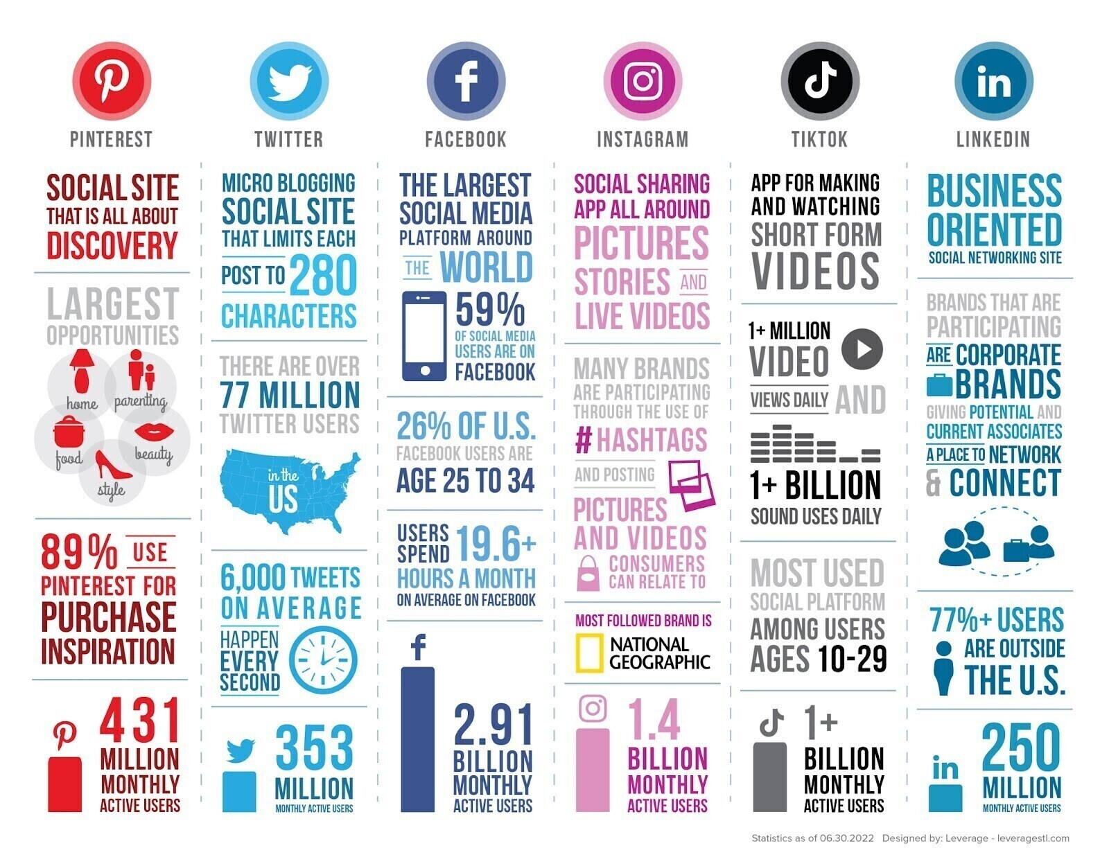
Source: Leverage
Last but not least, don’t miss the chance to pepper your infographic with potent quotes and actionable calls to action – they’ll leave viewers captivated and wanting more.
2. Playful layouts
Gone are the days of rigid grids and predictable flow. In 2024, the trick is to inject a dose of playful disruption into your infographic layout. Add surprises to your design with unexpected angles, diagonal grids and dynamic compositions.
It’s not just about chaos, though. This playful rebellion is about intentional disruption. By breaking the grid, you create visual intrigue that get viewers to linger and explore.
Here’s a simple but fun infographic design that break down holiday facts using a Christmas tree layout.

The idea is to picture your infographic as a treasure hunt. Hide data gems throughout to entice viewers on a rewarding journey toward deeper knowledge.
MGL’s Sales Training Infographic guides readers through data points with a clear roadmap. The icons and subheadings makes the process easier to understand for readers.
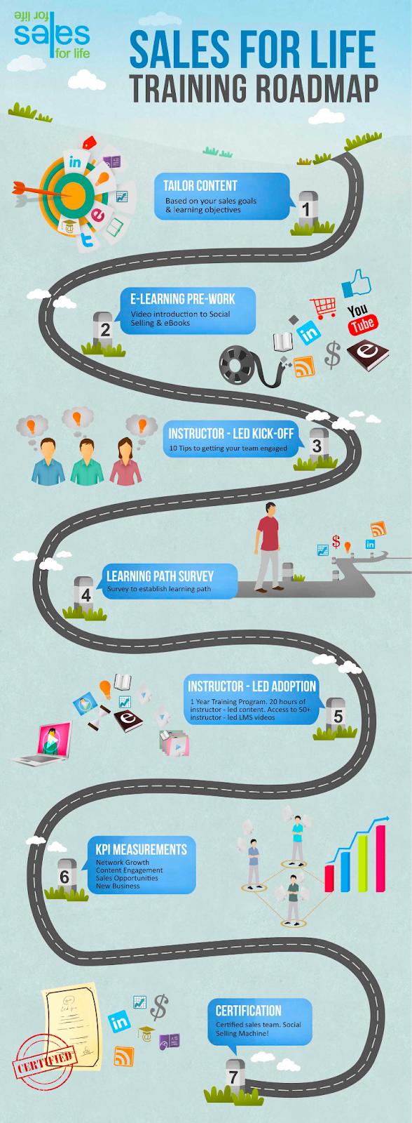
Source: Behance.net
Unexpected layout choices can also inject humor and surprise. I personally love how Jing Zhang designed these enticing recipe cards.
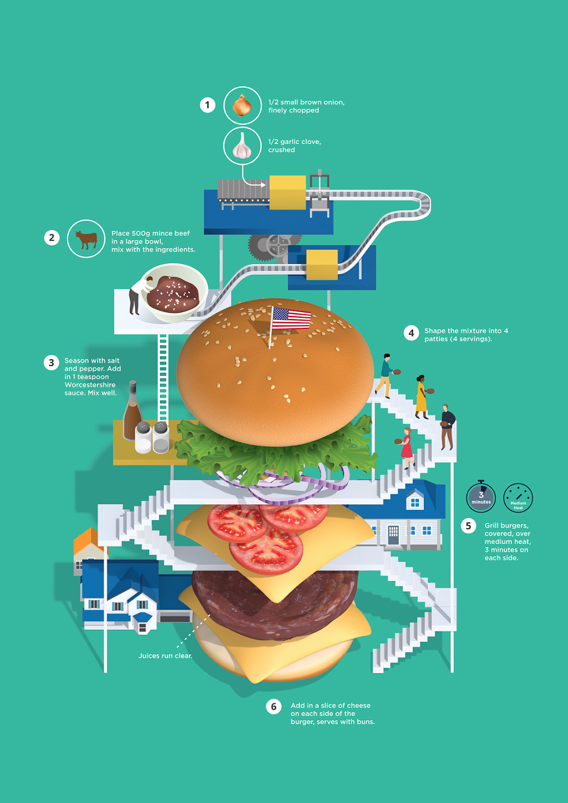
Source: Venngage
Searching for a timeline infographic? Or maybe a comparison chart? Whatever your vision, Venngage’s pre-designed infographic templates are at your beck and call.
All you have to do is register for a free account and you’re all set to ditch the black canvas!
3. Data as illustrations
Pie charts and bar charts are no longer the only ways to present raw data. In 2024, infographics turn data into visually appealing images.
The possibilities are as varied as the data itself. Imagine butterfly patterns or hummingbird wings representing data flows or climate trends. Let’s look at how data sets the pace for infographics.
U.S. Global Investors simplifies the overview of commodity returns over the past decade. The infographic presents complex data in an easily understandable periodic table format.
تعليقات
إرسال تعليق